Give up a tenth of your phone's screen, and you carry 85% of an iPad mini in your pocket
Apple's specs, every screen at one scale
Most of us carry a phone, a tablet and a laptop for the same few things. Apple's first folding phone, the Duo, is short when folded and nearly an iPad mini when open. I think that odd shape says more: the keypad will go, videos will get wider, and the laptop will be for power users.
Amit Singh25 October 2026 · 22 min read
Apple's specs, every screen at one scale
I'm not an Apple insider, and I haven't used a Duo yet. I'm trying to make sense of where our devices are going: the technology, how people behave, what we watch, how we work, and AI. Here's where I think it all lands, my biggest take first. Then what follows from it: how we'll talk to our phones, what we'll watch and how we'll work. The rest of this note is me thinking it through.
I think one device will do it all.
Devices come and go. Remember the netbook, the small, cheap laptop? It sold 32 million in 2010. Then the iPad arrived, and within three years even Asus, which started it, had stopped making them. A device lasts only until something else does its job.
Now think about what you actually do on each one: browse, email, chat, call, watch videos. You can do most of it on any of the three. Around the world, about 59% of web visits already come from phones.
Still, we keep buying all three. In the US, 91% of adults have a smartphone, about three in four a laptop or a desktop, and about half a tablet. That's three chargers and three things to keep updated. It's inconvenient, and it's expensive.
The phone has done this before. Someone counted 13 gadgets in a 1991 RadioShack ad that now live inside a phone. A clock radio, a calculator, a camcorder, an answering machine and more. Together they cost about $3,000.
So what would the best device look like? A big screen, the power of a good laptop for the people who need it, and it fits in my pocket.
A big screen that fits in a pocket has to fold. I can't see another way to get there.
Some people think glasses will replace the screen. I think that's a decade away, at least. We need to see things, and a screen that folds is the surer bet.
A watch is too small to see much on, and AirPods have no screen at all. Both are great at their jobs, but neither grows into a computer. The pull of a phone is that you can see the world on it.
The Vision Pro is impressive, but it asks for a big change of habit: a computer on your face, for hours. From what I've read, about 390,000 sold in its first year, production stopped in early 2025, and the cheaper model was put aside for glasses.
Folding phones are the other way round: people already want them. Huawei's phone that folds in three had 6.5 million people sign up to pre-order it, at about $2,800. The Duo costs $1,999, and its pre-orders sold out in minutes. With folds, the problem has been the crease, the hinge and the weight, never the wanting. With Apple, I'm not even sure the price matters.
So I think Apple is right to push here. I haven't used one, but going by the reviews, it's a very good first version.
The obvious folding iPhone was easy to picture: the iPhone you know when it's folded, and two of them side by side when it opens.
That's the shape you already hold. An iPhone 17 Pro's screen is about 2.2 times as tall as it is wide. Two of them side by side make a screen that's nearly square, about 1.1 to 1. Folded, it would just be an iPhone, and every app already fits an iPhone. Google and Samsung both sell folds built this way.
Apple didn't do that. Folded, the Duo is short and wide, and open, it's the same shape again. A company like that doesn't skip the obvious choice without a reason. I don't know what goes on inside Apple, but I can look at the shape and think it through.
There's an idea I like for this, Chesterton's fence: before you pull a fence down, find out why someone put it up. So I take the shape as my one fact and keep asking: if this is true, what else has to be true? Each answer is one of the takes at the top.
Apple's specs; our arithmetic. Shapes are long side to short; the screen is the folded one against an iPhone 17 Pro's
Fold a screen in half, and the open screen is just two folded screens side by side. So the shape of the folded phone decides the shape of the open one. Make the folded phone tall, and the open screen comes out nearly square. Make it shorter and wider, and the open screen comes out wide.
Starting from the iPhone, I see five ways Apple could have gone. The table puts them side by side.
Only one shape comes through a fold unchanged, and that's √2. Apple used it for both screens.
Both of the Duo's screens are close to √2, about 1.41 to 1, the shape of A4 paper.
√2 has a quiet beauty. Fold an A3 sheet in half and you get an A4, then an A5, then an A6, all the same shape. That's why a copier can shrink an A3 page onto A4 with nothing cut off. The Duo plays the same trick: open it, and what's on the screen just scales. But the symmetry has a cost, and Apple chose to pay it.
Then I noticed something. Folded, the Duo is 117.8 mm tall. The first iPhone, in 2007, was 115. The Duo's screen is almost the same shape as that first one too, 1.45 to 1 against 1.5. And at 84 mm across, the Duo folded is the widest iPhone ever.
Apple's specs: each body at true size, its screen's shape under it; the dashed line is the first iPhone's height
Every iPhone after the first got taller, while the width barely moved, from 61 mm to about 72. A phone has to fit a hand, so the only way to add screen was up.
Apple's specs; each edge close up, all at one scale
The fold frees the width, and the phone goes back to its first shape.
It's thin, too. Folded, it's 11.3 mm, a little thinner than the first iPhone's 11.6. Open, it's 5.2 mm, thinner than the iPhone Air, which at 5.64 was Apple's thinnest phone until now.
So the thickness people worry about is already behind us. Look at the Duo folded in the exhibit: two leaves, each thinner than an iPhone Air. Two iPhones' worth of screen now folds into less than one phone did in 2007.
Here's the cost of that shape, and it lands right in the chat apps we open most.
Against an iPhone 17 Pro, the Duo folded has 10% less screen, and it's 22% shorter and 16% wider. Pick your own phone in the exhibit. Every recent iPhone, Pixel and Galaxy is taller.
Makers' specs, October 2026

signüll@signulll
just played around with the iphone duo & i'm a lot less compelled to get one than i thought i'd be. almost every interaction without opening the phone feels awkward as hell. & having to unfold it for things that should take a second introduces a surprising amount of friction.23 October 2026 on X ↗
you're basically trading simplicity for a lot of workflows for reduction of complexity for few.
Start a reply on the Duo folded, and the keypad takes about half the screen, reviewers found. Reading is fine, and typing is fine. The problem is what the keys leave above them: two or three messages, like a mailbox slot.
signüll, whose posts on usability I follow, found a second cost on a first try: unfolding the Duo for things that should take a second.
And this sits right on top of what we do most. WhatsApp gets opened more than 20 times a day. We check our phones 186 times a day, and a lot of those checks last a few seconds, too short to unfold for.
My read of how each is used
So I pictured a day with it. Videos I'd mostly open it for, though not for a clip or two. A game asks for five or ten minutes, so I'd open it. Films, documents and photos too.
The small screen is for the moments when you don't know if you'll be a minute or five: checking WhatsApp, an email, your feed on X. Today those apps are built for a tall phone. Made for the Duo, I think they cross over to its side, as in the exhibit.
And for those moments, I think the app can take the shape of the screen, like water. A chat, an inbox or a feed fits a wider, shorter screen as well as a tall, narrow one. We lose a little height, and we scroll anyway.
On a desktop, apps have a sidebar. On phones we lost it, or it became a bar at the bottom. On the Duo, it can come back. Folded, its screen is about a centimetre wider than an iPhone 17's. That's just enough for a column of faces down the side, and the app beside it is still as wide as an iPhone's whole screen.
Each phone at true size, from Apple's specs; the iPhone 17's apps as they look today
So I tried it on the apps we open most, the ones where a tall phone seems like the right shape. With the chats down the side and no keypad, you see more of a conversation than an iPhone 17 shows while you type. Email and the feed fit the same way, and a short video shows half as much again of a wide picture.
So signüll is right about today: replying is cramped, and unfolding is friction. But I think he's judging the Duo on today's interfaces. Maybe the Duo is a little ahead of its time.
So why would Apple pick it? Its own answer is continuity: open an app folded, unfold it, and the app just grows. That's good. But it isn't a reason to accept a cramped keypad on the screen you use most.
Apple also says it didn't want the open Duo to look like two phones stuck together. I get that. It still doesn't explain paying for it every time you reply to a message.
Here's how I read it. The Duo folded is only cramped while a keypad sits on it. If the keypad shrinks or moves, the problem goes away. So whatever Apple says in public, this shape is a bet that the keypad is going.
And the safe choice was right there. Google's first Pixel Fold, in 2023, had a short, wide outer screen too, and apps didn't fit it well. A year later, Google went back to a tall one.
If Apple thought the keypad and today's apps were here to stay, it would have done what Google did. It didn't. That's the bet.
Look at what moved. On the Duo folded, the status bar runs down the right edge, a strip about half an inch wide, and apps sit to its left. Across the Duo's software, controls moved from the bottom of the screen to the side. Only the keypad still sits across the bottom.
And look at writing. In June, Apple built AI dictation into the iPhone's keypad. At the Duo's launch, it showed writing with Siri just by saying what you need. It also showed Siri on one side of the screen while you look at the other.
I don't see Apple polishing the keypad. I see it building the way around it.
The way I think about it, the future of devices comes from three other futures: what the technology can do, what we watch, and how we work. The Duo's shape fits all three.
Technology brings folds, talking, and screens that AI draws, so the keypad can shrink. What we watch is short video, so the screen should get wider. At work, AI does more of the job while we talk, so the laptop goes back to power users. Technology first, and it starts with the keypad.
The iPhone was born when Apple got us to give up the plastic keypad. I think the Duo will one day get us to give up the keypad on the screen. The reason is the same both times: more room for our eyes.
Everyone remembers the first iPhone: no plastic keys, just a giant screen. Since then, Apple kept finding more room. The first iPhone's screen covered about half of its front, and a 17 Pro's covers about 89%. The home button went. Now the fold doubles the screen in one go, and on a folded screen this short, the keypad is what's left in the way. So it's next.
Typing was never natural anyway. The keyboard comes from the typewriter, and the phone keypad was even worse. Remember texting on one? To get an S, you pressed 7 four times, and if you pressed once too many in a rush, you had to go round again. T9, then swiping, then predictive text: each one was a patch on something unnatural.
Talking is different. Every child learns to talk without being taught. Reading and writing have to be taught, and hundreds of millions of adults still can't do them well. Not every human types. Every human talks.
And talking is faster. In one Stanford study, people spoke 153 words a minute into a phone and typed 52, about three times as fast. Talking left a few more mistakes in the final text. That's the job left for the keys: fixing a word, not writing the whole message.
Wispr Flow, an app that writes what you say, already shows how small the keypad can get. On the iPhone, its keypad is little more than one button. You press it, you talk, and it writes. Wispr says that after three months, its users write more than half their text by talking. For most of the day, a button is enough.
The phone has already eaten the alarm clock, the camera, the calculator, the iPod, the Walkman, the map, the compass and the wallet. It's time it ate the keypad.
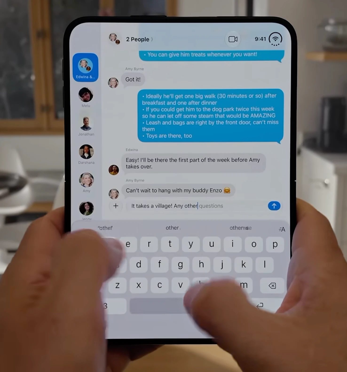
In the mini keypad, space and return move to the right ends of the letter rows, and this row goes.
Picture: a frame from Dave2D's video on YouTube
Look at the Duo folded today. It runs the iPhone's keypad as it is: three rows of letters, then a fourth row for 123, the space bar and return. That fourth row is the easiest to cut. Nothing about a wide screen needs it. It's there because it has always been there, which is a fallacy with a name, the appeal to tradition.
On a screen this wide, space and return can sit at the ends of the letter rows, and the numbers can share the top row. That's three rows instead of four. I call it the mini keypad, and it takes the chat on the Duo from 1.8 inches tall to 2.5.
Go one step further and move the keypad into the strip that already runs down the edge of the folded screen. A few keys sit over a button you press to talk, and the letters come out only when you call them. Now the chat gets the full height: 3.9 inches against 2.7 on an iPhone 18 Pro replying today, 44% more. The exhibit steps through all three.
Apple's specs and photo; a developer's measure
To be fair, an 18 Pro with its keypad down still shows more chat than this. The point isn't that the Duo is taller. It's that the Duo is wide enough to move the keypad out of the way. With the keys at the side, an app on the folded Duo is still 2.5 inches wide, nearly an 18 Pro's 2.6. On a narrow phone, a side keypad would squeeze the app. On the Duo, it fits.
My construction; two of its moves are Apple's today
If talking becomes the way in, the keypad stops being a typewriter and becomes an editor. You say the message, then tap to fix a word or move a line.
And the strip can change with what you need. It shows a number pad when you need numbers and letters when you need letters, with a box for symbols and one for emoji and GIFs. Most of the time it can guess. Apple's already halfway there. You can ask Siri to rewrite or proofread what you wrote, and you can hold the space bar to move the cursor like a trackpad.
In the strip, the space bar is the longest key, so it can sit at the top, far from the thumb. A big key is easy to hit even when it's far away. The small keys sit lower. The button you press to talk is the last one, at the foot, where the iPhone keeps its mic key today. Samsung phones already keep a panel of tools at the screen's edge, so a strip at the edge isn't new.
The one argument against this shape that I take seriously is the thumb.
Make a phone this wide, and it starts to feel like a two-handed device. A lot of the time, I use mine with one hand. But why does the keypad have to sit at the very bottom, stretched from edge to edge? Is that where my thumb wants it?
So I thought about how I actually hold a phone. I hold it from the bottom right, so my thumb starts at that corner. It doesn't sweep a neat quarter circle. It reaches further up than across, more along a 60-degree line than a 45. The area it covers easily is about 36 square centimetres, about the same on small phones and big ones. On the Duo folded, that's two-fifths of the screen.
A keypad you talk to needs only a few things: talk, send, fix a word, and the letters now and then. All of that fits in the patch.
And it's not only for typing. Take a photo editor. Tap where your thumb rests, and the tools fan out on one ring and the filters on the next. All of it stays inside the thumb's reach, as in the exhibit. The photo keeps the whole screen. That's design thinking at its simplest: start from the hand, then draw the screen around it.
The reach's area: Le and others, CHI 2018; its shape, from the corner, and the layout: my sketch; photo: Backside
Microsoft tried an arc of keys for one thumb on the iPhone back in 2016. It had no reason to catch on while we typed everything. Talking gives it one.
I haven't held a Duo, so I can't say how this feels in small hands. That's the part I'm least sure of.
People say talking to your phone in public is awkward. I don't buy it.
Ever since the first phone call in 1876, a call has meant talking to a machine. We hold a slab to our ear and walk down the street talking, and nobody blinks. WhatsApp users send billions of voice notes every day.
Video calls became normal after Covid, and on a lot of them, the cameras are off. In one survey, only half of professionals kept their camera on for the whole call. So we already talk to a screen with no face on it. That habit is learned.
Sit in a café while someone takes a work call. Nobody minds that they're talking; the next table is talking too. What bothers people is the voice coming out of the phone's speaker, louder, and now everyone hears both sides. In one poll, 75% of Americans said a call on speaker in public is unacceptable. There's even a word for it now, loudcasting. The considerate people wear headphones.
So talking to your phone isn't the rude part. A phone talking back out loud is.
There's a catch, though. Back in 2016, only 3% of iPhone owners used a voice assistant in public. Part of that is the spotlight effect: we think far more people notice us than really do. Part of it is habit: we keep doing what we already do. So on a bus or in a meeting, people will keep typing for a while. I think earbuds close the gap, but not overnight.
And our writing will sound more like speech. Messages, posts and even emails will get shorter and plainer, because they were said before they were written.
For us, the easiest things are to tap and to talk. For a machine, the easiest thing isn't to talk back. It's to write code. So the future of input is voice, and the future of output is code: screens the machine draws for us.
Your weekend, for your run
Rain on Saturday morning, dry on Sunday.
My example; the card is one of Organic's own
A lot of people picture the future as a conversation: we talk, and the machine talks back. Some of that will happen. But most of what I want from a phone, I want to see: a route, a price, a photo, three times that work for a meeting. Most of us already watch videos with the sound off when we're out; in one survey, 69% did.
Voice will still be everywhere in what we watch and listen to: podcasts, videos, calls. But a voice inside a video isn't the machine answering you. When the machine answers, I think it will mostly show.
AI got good at code first, and code is how a machine draws a screen. So it will answer with a screen made for that moment and thrown away after. Google's Gemini already does this for some answers: it designs a little interface on the spot. Code is now cheap enough to write for one answer.
This makes the tap far more powerful. On a travel site today, you find the right flight yourself, with filters and sorting. Now the machine can put the right three choices in front of you, and one tap gets you there. You type less because there's less to say.
In the exhibit, I ask if it'll rain on my run this weekend. Said out loud, the answer is four days of numbers to sit through. On the screen, it's one card made for that question. Saturday's rain stands out, and one tap moves my run to Sunday. Then the card is gone.
And when you do have a lot to say, an email or a long message, you talk, and it writes.
This note, its research and its exhibits were made with Ronic. If you want to write better blogs, you can use it too. Stay tuned, and follow me on X for more.
I believe short video will get broader, toward √2. TikTok, Reels and Shorts will stay, but their shape will widen, and we'll lose less of every scene.
That was the technology. The second future is entertainment, and it isn't the TV or the cinema. It's TikTok, Reels, Shorts and micro-dramas, watched alone, in your hand. YouTube Shorts gets more than 200 billion views a day. Micro-dramas made about $11 billion last year. Cinemas took less in 2025 than in 2019.
If it weren't for our hands and pockets, we'd all want wider phones. Height comes free, because we scroll.
Photo: George Milton on Pexels; our arithmetic
Take one picture and cut it two ways, the same size: once tall, 1 by 2, and once wide, 2 by 1. In the exhibit, it's a podcast. The tall cut keeps the brick wall and the floor, and loses both faces. The wide cut keeps both people talking, and that's the story.
Tall gives you more sky and more ground. Wide gives you more of life. What we lose going vertical is worth more than what we gain.
I think there's a reason cameras, films and TVs were wide from the start. Our eyes see wide: about 200 degrees across, and about 135 up and down.
Phones went tall because of the hand. Then TikTok came. It couldn't change the phone, so it changed the video, and we all learned to film tall. That fixed TikTok's problem. It didn't fix the picture.
TikTok had to fit the phone. Apple owns the phone's shape, so Apple can change it, and with the Duo, it has.
Remember the short video in the apps exhibit? Play a wide video full screen on an iPhone 17, held upright, and you see a narrow slice of it, about 31%. The Duo folded is broader for its height, so the same video shows 46%. A shorter, broader phone hides less.
On TikTok, a tall phone hides even more: the buttons run down the right and the caption covers the bottom. TikTok's own ad template keeps faces and words to the middle 41% of the frame, the part nothing covers.
That's what the phone changes. What I really think has to change is the video itself.
Our arithmetic
I think vertical video is a bad idea. Reels, TikTok and Shorts are 9:16, a tall slice cut from a wide world.
If you shoot video, you know the trick: shoot wide, crop to vertical later, and the context is gone. A 9:16 frame cut from a 16:9 video keeps only 32% of it.
Photos are already moving that way. Most of the photos people post are upright 4:3, and Instagram's grid went from squares to 3:4. 3:4 is much closer to √2 than 9:16 is. It's video that's stretched.
I think the people making micro-dramas will thank Apple. On a wider screen, fewer heads get cut off at the edges, and more of the scene makes it in.
The Duo also brings the phone back to the shape of every other screen we watch. Cinema, TV and laptop screens are all wide. The phone was the odd one out, standing on its end. Open, the Duo is wide again, right next to the iPad.
Makers' specs: each screen's shape at one height, long side over short
Our eyes love this. It's our hands that have to learn. And once the keypad goes, our fingers will thank Apple too.
The third future is work. I'm very sure most coding will happen on a phone. Most of it will be vibe coding: you say what you want and check it on the screen. The rest is power coding, and that's who the laptop is for.
Computers were made for programmers first, then everyone got one. I think the laptop now goes the other way, back to the people who really need it.
Coding is already moving to talking. People tell the machine what they want, it writes the code and fixes the bugs, and they nudge it along. Some hardly touch a keyboard anymore. At Google, AI already writes 75% of new code. Claude Code has run on the iPhone since October 2025.
There's a funny sign of where we are today. People walk through airports carrying open laptops, like pizzas, so their AI agents keep working. Most phone tools still steer an agent on your laptop, so it has to stay awake; the ones that run in the cloud let you close it. I think we'll laugh at the open laptops soon.
Most people who code aren't hardcore programmers, and the new ones start with AI. GitHub counted 36 million new developers last year, and 80% of them used its AI helper in their first week. I think the number of people who build software grows ten times, and most of them will learn by talking to a machine, on their phones, not by learning Java or Python.
And it's not just coding. Writing an email, making a deck, joining a call: you say it, and you check it. A camera, a mic and a screen do the job. The keyboard and the mouse are for the power users.
I don't think we've seen what two screens side by side can do, when you tap on one and talk to the other. Someone will crack it, and with AI, everyone else will copy it in weeks.
In launch week, apps that weren't updated ran with black bars, and some big ones, like Gmail and Google Maps, had no Duo layout. But about half the apps had one within a week. Facebook took 18 months to make its first iPad app.

Robert Bye@RobertJBye
Here's the new Claude experience on the iPhone Duo! It's going to be amazing for multitasking, Claude Code, and creating new things.
Looking forward to see folk start using it tomorrow!
 23 October 2026 on X ↗
The day before launch, Robert Bye, who works on Claude at Anthropic, posted the Claude app on the Duo. He said the screens were mockups Claude made for the team: the interface for a new phone, designed by AI. Under his post, people kept asking where the keypad went.
The first two-screen ideas are already here. The camera shows the photo on the outside screen, so the person you're shooting can see it and pose. For kids, it plays a Peanuts cartoon on the outside to get them to look at the lens. Half open, a film plays on top and the details sit below.
Memes often show us the future before we see it. People have already turned the half-folded Duo into a tiny Mac, a toaster, a Nintendo DS, a cassette player and a clock with the weather. I love that.
Apple won't be the creative force here; the creators will. With tools like Claude, Gemini and Nano Banana, anyone with imagination can make what they picture, fast. We're in for a fun ride.
There are teething problems: dust in the hinge in one test, a few inner screens cracking near the fold, apps that still look wrong. I'm not talking about this year's Duo.
AI makes moving every app to the Duo nearly free. For me, the bigger thing is the new ways of working that two screens bring.
Put it together, and I think the Duo takes the place of the iPad and the regular iPhone, and the laptop becomes a tool for power users. A phone in your pocket that opens into a small tablet is hard to beat.
Apple's specs, October 2026
The iPad was always a device for watching and reading. People said so from the start, in 2010. All it really had was its big screen. The fold puts that screen in your pocket.
Open, the Duo is 85% of an iPad mini. Honestly, that's enough for most of what I use an iPad for.
I think the Duo is the most thoughtful thing Apple has made in years, and most of us don't see yet how big a moment it is.
It's built for a future that's still arriving: we talk more than we type, pictures are wider than a reel, and AI draws the screens. Most of its flaws belong to today's interfaces. The one that belongs to its shape is the thumb, and I think the keys will move to meet it.
If you build products, the screen your customers hold is getting wider, and they'll talk to it more than they type. A website laid out only for a tall phone will look thin on the Duo. A sign-up form with ten fields to type will feel slow. A post made only at 9:16 loses the most on a wide screen.
I think the next big step is a Pro Max Duo: the same √2 shape, a little bigger each way, maybe 5% taller and 5% wider.
Today the Duo folded has a 5.4-inch screen, and at 254 grams it's the heaviest iPhone yet. Once it gets lighter, the next question will be height: why should I give it up? A bigger Duo answers that. Folded, about 5.6 inches; open, about 8, against 7.6 today, closer to an iPhone folded and to an iPad open. Apple will charge a lot for it. I wouldn't be surprised by $5,000.
Apple's, Huawei's and Samsung's specs; the Pro Max is my guess: the Duo, 5% bigger each way
The other path is the trifold. Huawei has one, and Samsung made one last year. I assumed three tall phone screens side by side would make a TV's 16 to 9. They don't. Huawei's opens to about 1.43 and Samsung's to 1.36, both close to √2. Everyone keeps landing on the same shape. If trifolds get good, we get a taller phone folded and a bigger screen open. Maybe. But I think one fold and √2 is enough for most people. The width is the part worth keeping, because it lets you see more.
My other worry is supply. New orders now ship in late January, and Apple limits orders to two a person. From what I've read, the hinge has more than 100 parts, and it's slow to make. If people can't get one, the habit forms more slowly.
If I flip all this around, here's what would make me wrong. Glasses get good and normal much sooner than I think. People never take to talking in public, so the keypad stays and the Duo stays cramped folded. The keys never move under the thumb, so a phone this wide stays two-handed. Next year's Duo comes out taller and narrower, which would mean Apple stopped betting on the keypad going; Google made that turn in one year. Short video is still 9:16 in two years. Or folding phones stay small: about 20 million this year, about 5 million of them Duos, so the rest shrank by about a quarter.
Everything here comes back to one bet, Apple's and mine: the keypad goes, because we'll talk to our phones and they'll answer with screens. If you already talk to your phone more than you type, the Duo is your next phone.